So, about a week ago I told you guys about Alien: Isolation.
As I mentioned in my little announcement trailer post, I’m cautiously optimistic that Alien: Isolation won’t suck. If you ask me, that’s high praise after the disaster that was Aliens: Colonial Marines, better known as “that which shall not be named”.
It looked a little dated…
If you’ve watched the trailer, you might have come to the same conclusion that I did: that Alien: Isolation looks a wee bit dated. Not hideously dated, but a little dated none the less, and not in the “Well yeah, the movie was filmed in the 70s!” sort of way either. No, more like Doom3.
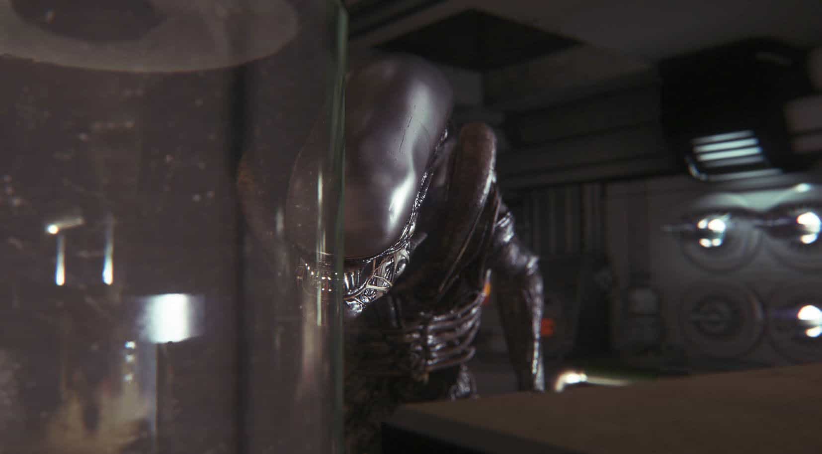
I was a bit concerned, and then I saw this set of high resolution screenshots for the game. Now I’m not so sure.
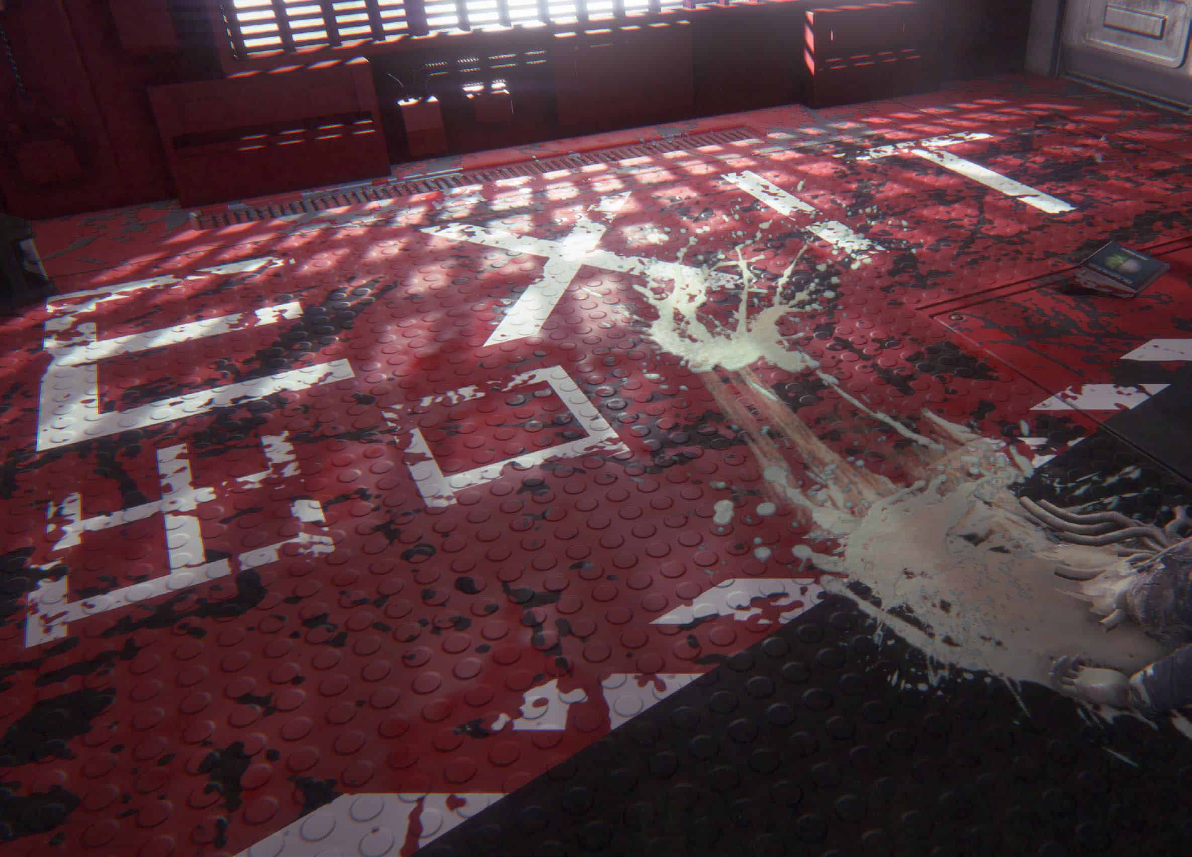
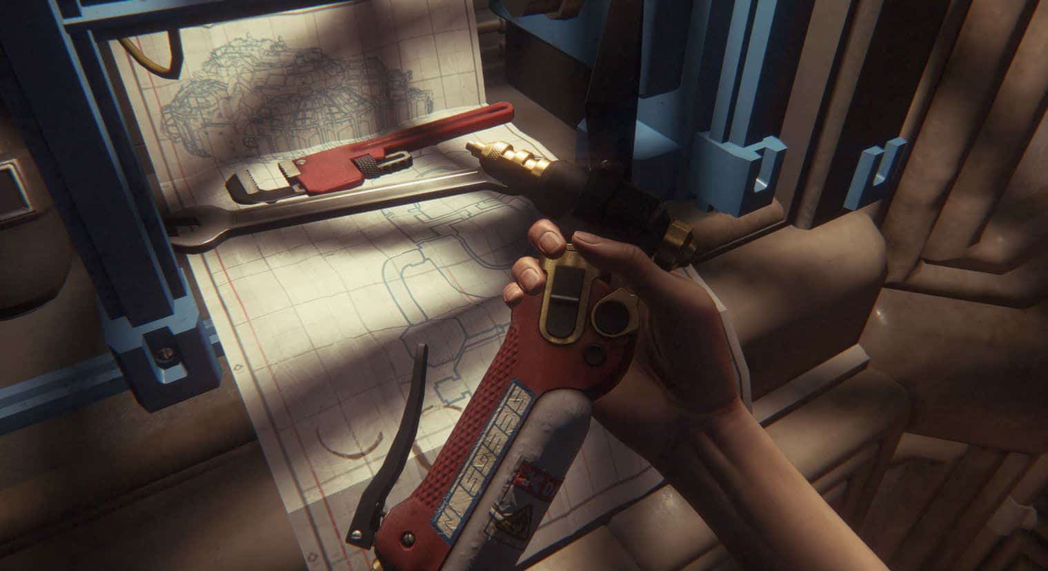
I’m slightly embarrassed to admit that I really and truly believed this was a painting accident. I now know the truth, but this sure did look like paint to me. Someone has been screwing around!
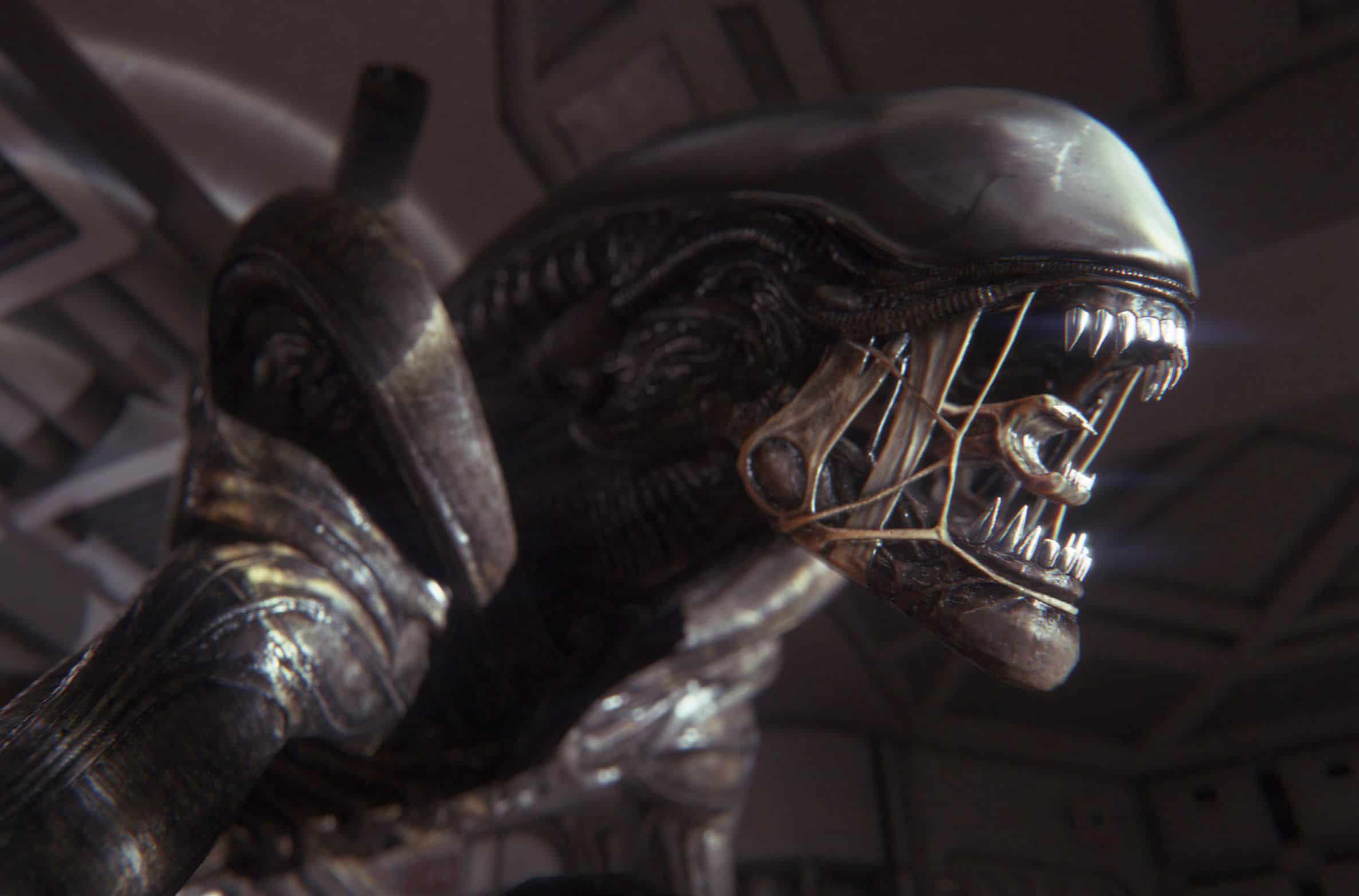
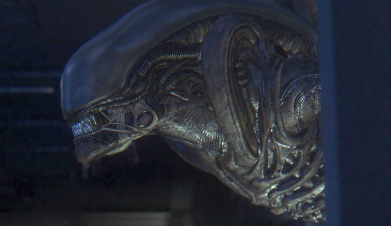
This is one seriously creepy looking alien! In every other Aliens game I’ve played, the aliens look aggressive, but not particularly creepy. Not so with this game. Out of all the screenshots, this one gives me the most hope.
Well, yeah… this one is a bit creepy too.
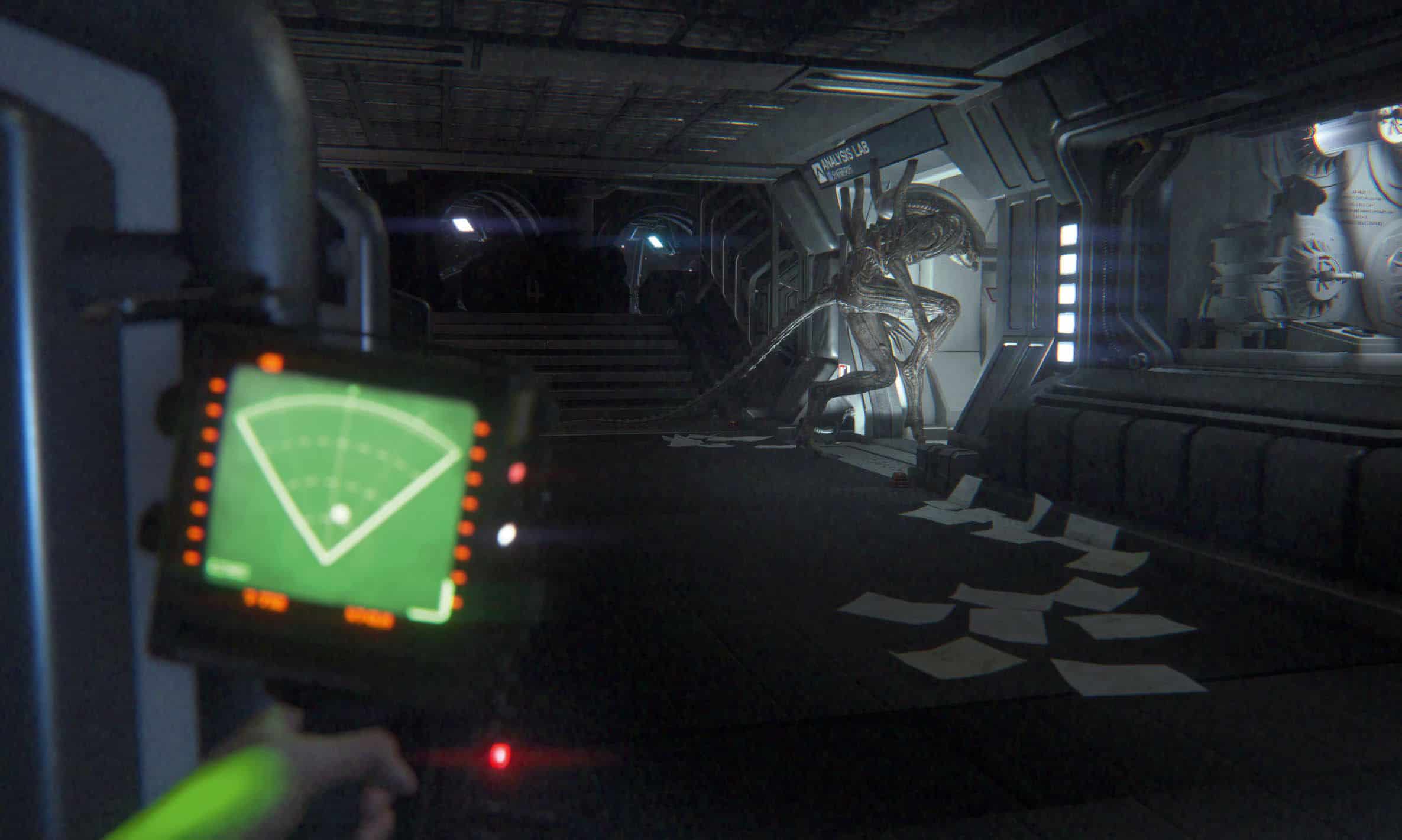
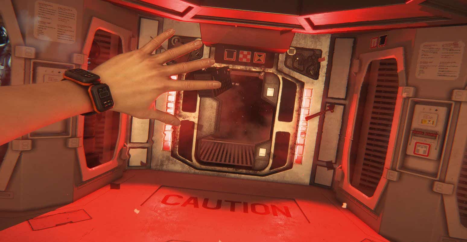
Apparently Ripley’s daughter is wearing a Pebble Smart Watch.
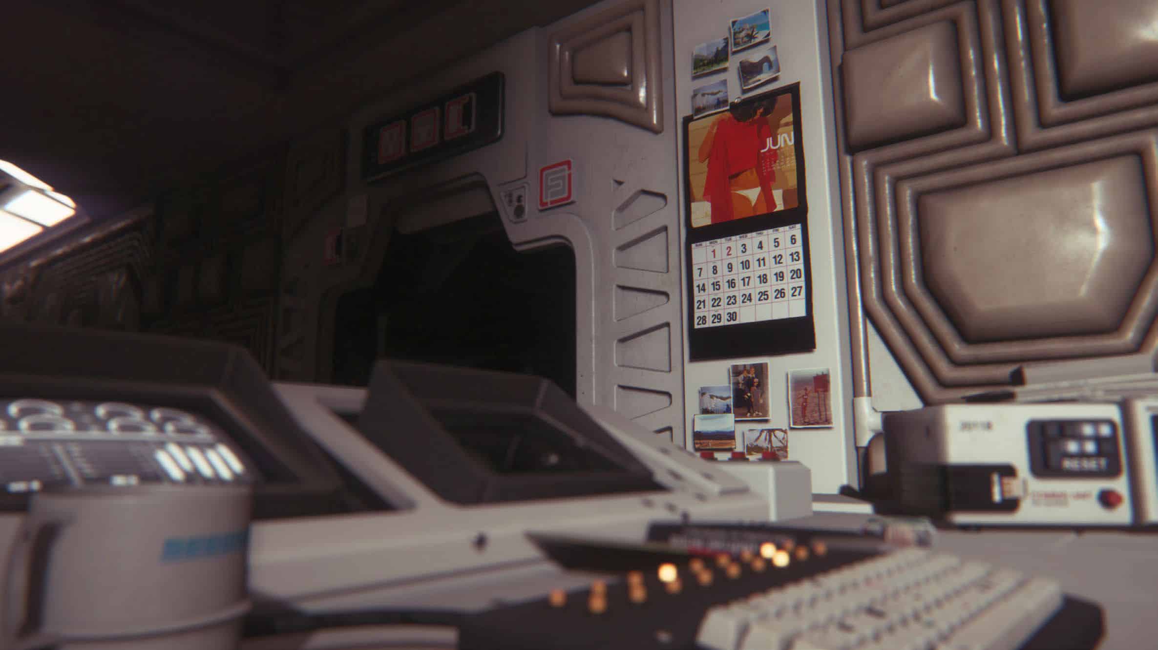
What can I say? This looks fantastic. These guys have done a fantastic job capturing the essence of the Alien universe.
Even after all these years, H.R Giger’s designs have held up beautifully. If you haven’t heard of the man, well… he’s the fellow that created much of the Alien “look”.
I hope you guys enjoyed this collection of high resolution Alien: Isolation screenshots, and I’m hoping to have a lot more material to share with you guys in the coming months.
There’s currently no known release date, but I expect that’s going to change. My money is on an announcement at this year’s E3.
