Clickfunnels is one of the best tools for creating stunning landing pages to convert visitors into leads and sales. Marketers use different tools and software to create beautiful and high-converting sales funnel and landing pages. You will find many landing page builders in the market, such as ClickFunnels, Kartra, Builderall, lead pages, 10-Minute Funnels, and many more.
Also, read the ClickFunnel vs. Kartra Comparison in terms of the best landing page builder.
ClickFunnels is the most popular marketing software, which is specifically designed to create exciting landing pages and sales funnels in minimum time. With over 110,000 users worldwide, it is the best of its kind. Before choosing it as your new software to build landing pages, check what other users have created with ClickFunnels.

Here is a list of websites that are made using ClickFunnels.
1- Mint
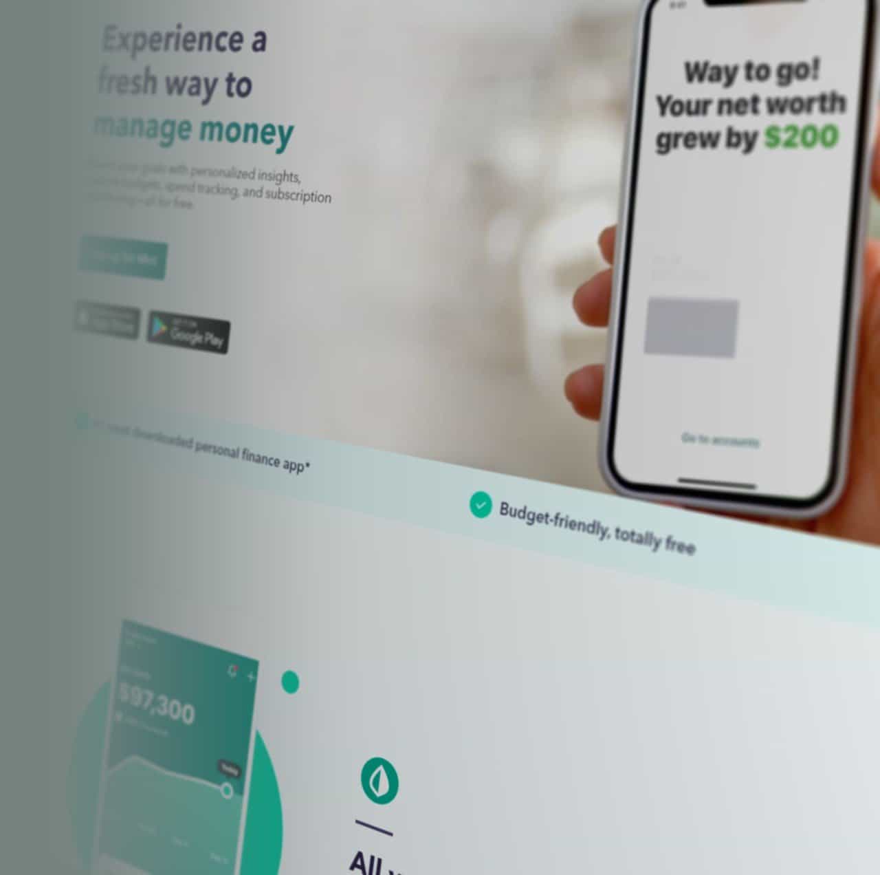
Mint is a website that offers financial data tracking services. It is a business-to-consumer site. The layout is pretty clean, simple, and straightforward. You will find the sign-up button at the top and bottom of every page to ease your visitors. The idea of placing the action button two times is to sky-high the click-through rate. Everything related to designing is excellent on the Mint website, but the content could be improved more, especially the headlines, which will enhance the website’s functionality.
2- MIG Soap
Websites with central columns and white borders look elegant and sophisticated, also prominent your brand’s message. A series of questions follow the content of the MIG Soap website to develop an interest in the reader and evoke action.
3- American Orchid Society

American Orchid Society website is also built using ClickFunnels. Although the template is less aesthetically pleasing, it will provide the best CTA (Call to Action) by only having two spaces to fill out; name and email address. The social proof in the form of text (tweet) and profile picture will impact visitors. They make the most of enticing their audience with a gift.
4- SharpSpring Ads
SharpSpring Ads does well by offering a “free trial,” which is the all-time working element for bringing CTA to the audience. They offer “$100.00 credit” and “free trial” on their landing page.
The color scheme is white and blue, similar to Facebook. Every element on the page is spaciously displayed. Overall, it has a very clean-looking learning page with minimal text, making it easier for users to understand the brand and encourages a faster conversion rate.
5- Grasshopper

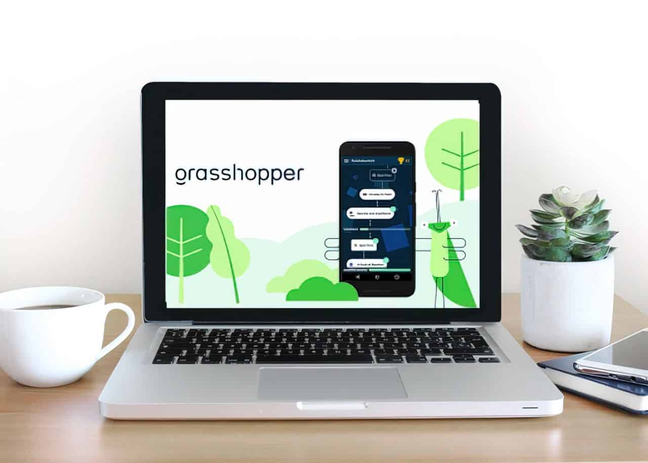
Grasshopper is another ClickFunnels website example. It is a service designed for better communication between businesses and customers. Grasshopper is created to provide several features such as; call forwarding, custom greetings, extensions, read voicemail, reporting, virtual fax, voicemail, incoming call control, business texting, simultaneous call handling, virtual fax, and VolP/Wi-Fi calling. ClickFunnels allows businesses to provide all the extensive features of their website.
6- Crazyegg
The crazy egg sales funnel is pretty big. Designed by ClickFunnels, this website is for high conversions. The crazy egg provides the best user experience and call to action for business purposes, from simple pricing pages to user-friendly informative blog posts.
7- Basecamp

Basecamp design keeps changing as they do a lot of split testing from ClickFunnels to determine the functionality of layout, visuals, and content. The cartoony graphics of this ClickFunnels template is undoubtedly the main asset of the website. Social proof, testimonials, and small quotes all make the entire experience more excellent and exciting.
8- MailChimp
MailChimp is the best ClickFunnels website example. The homepage is pretty simple and clearly defines a CTA button. The aesthetically pleasing look of yellow background, dark blue accents, and black font capture visitors’ attention.
Moreover, they played a neat trick of free subscriptions and allowed the users to send out 2000 emails.
9- Help Scout

Help Scout is an outstanding sales funnel built through ClickFunnels. The designs and animations have good contrast with the website theme. The content is easy to read with no messy background. The CTA is pretty straightforward and has several social proofs for convincing the visitor to become lead or consumer.
10- Planscope
Planscope is created to help you get complete control of your team, your agency, and clients on one page. It can help you to search out ways that are necessary for a better business. The website is quite simple and straightforward. There are three steps in this sales funnel; traffic, homepage, and pricing page.
11- Harvest
Harvest funnel template has the primary CTA (call to action) of their 30 days free trial on their homepage. It has two steps in the sales funnel; homepage and free trial sign-up. The home page of Harvest has some product explanations, a few reviews, and CTAs all across the landing page. And, the free trial sign-up has a popup and a free sign-up form.
12- Netflix

You have probably heard “Netflix” hundreds of thousands of times in your life. It is the most used video streaming service. Netflix is a paid platform that allows users to watch abundant award-winning seasons, TV shows, documentaries, and movies.
The site is elementary and nice-looking. The content is well optimized and shows exactly what you’re getting. You will not find any confusion in the copy of this landing page. The background image is constantly changing based on the shows and movies they are promoting. Netflix also offers a risk reversal, which means you can cancel your subscription anytime. It has two steps in the sales funnel; the homepage and the pricing page. The homepage clearly explains the no commitments state and the free trial. They highly emphasize the risk reversal in their timeline design for maintaining trust over the website.
You can also find FAQs on the homepage to scroll down and find the pricing info and subscription canceling process.
When you’re perplexed about your sales funnel, look at these 12 successful companies that are killing it with their sales funnels built on ClickFunnels. All of them are the best and highly converting ClickFunnels website examples to learn and skyrocket your own.

